Light, Scale, and Silence: A Collector's Guide to Living With Paul Nicklen's Work
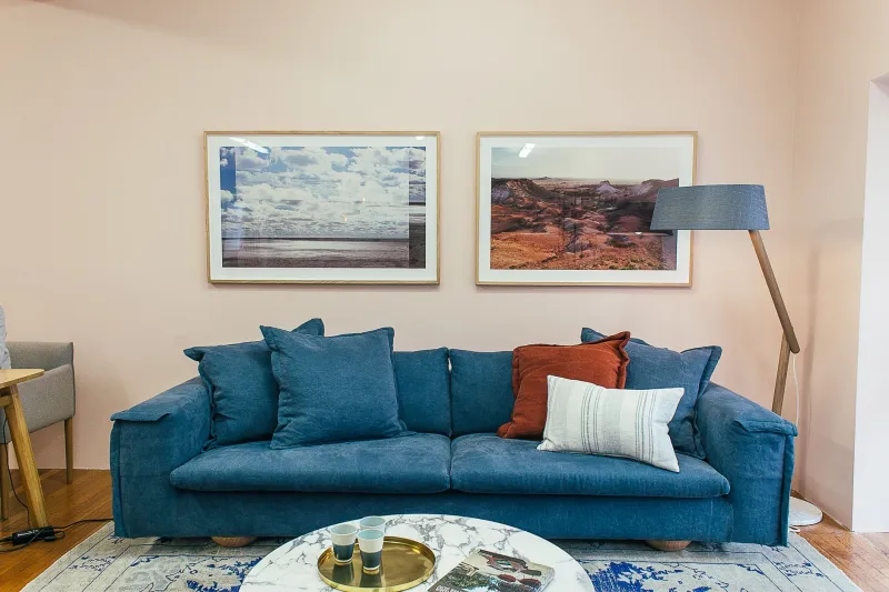
A Paul Nicklen photograph does not simply hang on a wall. It occupies a room. It changes the quality of silence in a space. It asks something of the people who live with it—a willingness to pause, to look carefully, and to allow the wilderness it contains to exist alongside the ordinary rhythms of domestic life.
For collectors who are new to his work, or for those expanding an existing collection, the question of how to display these images well is a meaningful one. It is not merely a matter of interior design, though design matters. It is a question of how to honor the image while integrating it into a living environment in a way that serves both the art and the space.
This guide addresses the practical and philosophical dimensions of that challenge.
Choosing the Right Print for Your Space
Nicklen's work is available in multiple formats and edition sizes, and the first decision a collector must make is one of scale. This is not a trivial choice. The wrong scale—in either direction—can undermine the impact of an otherwise extraordinary image.
For large, open walls in great rooms, loft apartments, or entry foyers, Nicklen's panoramic and oversized prints perform with particular authority. Images of vast ice fields, open ocean, or expansive aerial perspectives benefit from generous dimensions that allow the viewer to feel drawn into the landscape rather than observing it from a remove. A 40-by-60-inch print of a polar seascape in a room with ten-foot ceilings creates an immersive quality that smaller formats cannot replicate.
In more intimate spaces—a reading room, a bedroom, a private study—medium-format prints of closer subjects tend to work more effectively. A portrait-oriented image of a single animal, or a tightly composed underwater study, carries significant emotional weight at a scale that suits a quieter, more personal context. These prints invite sustained, close attention rather than panoramic impact.
For collectors working within the constraints of urban apartments, particularly in cities like New York, Chicago, or San Francisco where wall space is at a premium, the vertical format is often underutilized. A single, well-chosen vertical print—a diving gannet, a surfacing beluga—can anchor a narrow wall between doorways or windows with remarkable elegance.
Understanding How Light Interacts With Ice Imagery
Nicklen's photographs frequently feature subjects that are themselves highly reflective: sea ice, glacial faces, snow surfaces, and open water. These are images built around light, and how you light them in your home will significantly affect their appearance and longevity.
The most important principle is this: avoid direct light sources aimed perpendicular to the print surface. Direct overhead spotlights, while commonly used in gallery settings, can create harsh reflections on the print face—particularly on metallic or lustre finishes—that obscure fine detail in highlights. Instead, position lighting at a 30-to-45-degree angle to the wall, allowing the light to wash across the surface rather than bounce off it.
For prints displayed under glass or acrylic, museum-quality anti-reflective glazing is strongly recommended. Standard glass creates visible reflections in most domestic lighting conditions, which is particularly problematic for images with large areas of white or pale blue—the tones that dominate much of Nicklen's Arctic work. Anti-reflective glazing eliminates this problem almost entirely and is worth the additional investment.
Natural light is both an asset and a risk. A print placed to receive indirect northern or eastern light—diffuse and consistent throughout the day—will appear luminous and true to color. Direct sunlight, even briefly, accelerates fading and should be avoided entirely. UV-filtering window film is an inexpensive and effective solution for collectors who want to maximize natural light without sacrificing print longevity.
Wall Placement and the Psychology of Viewing Distance
The height at which a photograph is hung affects how it is experienced more than most collectors anticipate. The standard gallery convention of centering a print at 57 inches from the floor—approximately eye level for the average viewer—remains a sound baseline for most domestic settings. However, this guideline warrants adjustment based on how and where viewers will typically encounter the image.
In a dining room where guests are predominantly seated, hanging a print slightly lower than the standard gallery height ensures it remains in comfortable sightlines during conversation. In a hallway meant to be experienced while walking, slightly higher placement creates a sense of elevation that suits the transitional nature of the space.
Viewing distance is the other critical variable. As a general principle, the optimal viewing distance for a fine art photograph is approximately one-and-a-half to two times the longest dimension of the print. A 48-inch-wide print ideally wants six to eight feet of viewing distance. This is worth measuring in your space before committing to a print size, particularly in rooms where furniture placement limits how far back a viewer can stand.
Framing Philosophies for Wilderness Imagery
Nicklen's prints are available through the gallery with guidance on appropriate framing, and the choices made at this stage have a lasting effect on how the image reads in its environment.
For contemporary interiors with clean lines and neutral palettes—the kind of minimalist aesthetic prevalent in much of American high-design residential work—a slim metal frame in brushed aluminum or matte black tends to recede appropriately, allowing the image to dominate without visual competition. White or off-white mats in archival rag board create breathing room around the image and reinforce the gallery-quality presentation.
In warmer, more traditional spaces, natural wood frames in pale oak or walnut can complement the organic subject matter of wildlife and landscape imagery without imposing a rustic aesthetic. The key is restraint: the frame should serve the image, not interpret it.
For collectors who prefer a frameless presentation, face-mounting—adhering the print directly to acrylic—produces a sleek, contemporary result that suits modern interiors particularly well. This approach emphasizes color saturation and detail with striking immediacy.
Building a Collection Over Time
For those acquiring more than one Nicklen work, the question of how prints relate to one another within a space deserves careful thought. A gallery wall of multiple images can be extraordinarily powerful when the works share a tonal or thematic coherence—a grouping of Arctic studies, for instance, or a series of underwater images from a single expedition.
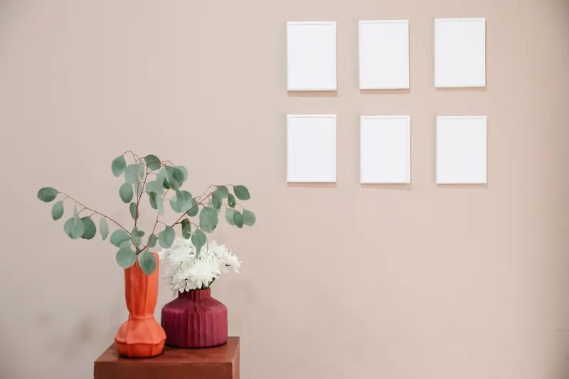
Spacing matters as much as selection. Prints placed too close together compete. Too far apart, they fail to converse. A gap of four to six inches between frames in a multi-image arrangement typically allows each work to maintain its individual integrity while contributing to a unified visual statement.
Living with a Paul Nicklen photograph is, ultimately, a daily experience of the wilderness made present. With thoughtful installation, that experience deepens over time rather than diminishing—which is precisely what the finest art is meant to do.