The Final Gesture: How Framing Transforms Paul Nicklen's Wilderness Photography Into Living Art
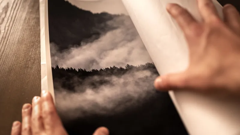
There is a moment, familiar to serious collectors, when a newly acquired print is leaned against a wall before hanging — still unframed, still searching for its context. In that moment, the image exists in a kind of limbo. It is complete as a photograph, yet incomplete as an object that will inhabit a room, hold a conversation with furniture and light, and carry the weight of daily life around it. For collectors of Paul Nicklen's work, that moment of transition — from print to presented artwork — is one of the most consequential decisions they will make.
Framing is rarely discussed with the same reverence as the image it surrounds. Yet anyone who has seen the same photograph presented two different ways understands instinctively that the frame is not a neutral border. It is an editorial choice. It shapes the emotional register of the work, signals the seriousness of the collection, and — in Nicklen's case specifically — either honors or diminishes the extraordinary environments his camera has documented.
Why Presentation Is Part of the Artwork
Nicklen's photographs are made in some of the most demanding environments on earth: beneath Antarctic sea ice, inside polar blizzards, at the edge of glaciers collapsing into cold water. The images carry within them a physical reality — temperature, silence, scale — that the viewer never directly experienced but somehow feels. A well-chosen frame does not compete with that sensation. It creates a threshold, a visual pause that prepares the eye and the mind to enter the image fully.
This is not merely aesthetic philosophy. It reflects a practical understanding of how the human eye processes art in domestic space. When a frame is too ornate, the viewer's attention fractures between the decorative border and the photograph. When it is too minimal without intention, the image can feel unanchored, especially in rooms with strong architectural character. The goal, as many experienced collectors describe it, is invisibility of effort — a frame so well-suited to the image and the room that it seems inevitable.
"I spent three weeks deciding on the frame for my beluga whale print," recalls a collector in Marin County, California, who has assembled a significant body of Nicklen's marine work over the past decade. "I kept returning to the idea that the ocean in that image has no edge — it just continues. I needed a frame that suggested openness rather than containment."
She ultimately chose a wide, pale ash wood frame with a deep float mount, which allows a sliver of negative space between the print and the mat — a presentation style that gives the image room to breathe while grounding it firmly within the wall's geometry.
Material Choices and What They Communicate
The material of a frame communicates before the image does. For Nicklen's wilderness photography, the most resonant choices tend to fall into two broad families: natural materials that echo the organic world depicted in the prints, and refined metals or lacquered finishes that place the work firmly in the context of fine art collecting.
Light-toned wood frames — white oak, maple, ash, or bleached walnut — have become a preferred choice among collectors displaying Nicklen's Arctic and Antarctic imagery. These materials carry an associative logic: the pale tones recall ice, birch forests, and the diffuse light of polar environments. They do not impose warmth on images that are, by nature, cool and vast.
Darker frames, including blackened steel, espresso-stained walnut, and matte ebony finishes, serve a different purpose. They create dramatic contrast and tend to suit Nicklen's more graphically intense images — the silhouette of a polar bear against a white horizon, the deep indigo of an underwater kelp forest, or the stark geometry of a leopard seal's open jaw. In these cases, the frame acts as a visual anchor, preventing the eye from drifting off the edges of the composition.
A collector in Brooklyn, New York, who displays several large-format prints in a converted industrial loft, describes his approach with characteristic directness: "The walls are exposed concrete and brick. I needed frames that didn't try to soften that. Blackened aluminum, very thin profile, no mat — it lets the image fight the room on equal terms."
The Question of Matting
Matting — the bordered insert between the print and the frame — is perhaps the most underestimated element of fine art presentation. For photography specifically, mat depth and color can dramatically alter the perceived luminosity of the image and the sense of scale it projects.
Deep mats, those measuring three inches or more on each side, create a sense of ceremony around a print. They signal that the image within deserves contemplative distance. For Nicklen's expansive landscape works, a generous mat can amplify the sense of wilderness scale, encouraging the viewer's eye to slow down before entering the frame. This approach is particularly effective for prints displayed in hallways, studies, or reading rooms — spaces designed for quiet attention.
Conversely, float mounts, in which the print appears to hover slightly above the backing without a traditional mat border, have become popular among collectors seeking a more contemporary presentation. This approach foregrounds the photographic object itself, emphasizing the texture of the fine art paper and the precision of the print's edges. It works especially well in rooms with clean-lined modern architecture, where the relationship between art and wall is meant to feel immediate and unmediated.
Color selection for mats is equally deliberate. Most conservators and experienced framers recommend archival white or warm white mats for color photography, as neutral tones do not introduce competing hues. However, some collectors working with Nicklen's monochromatic or predominantly cool-toned prints have found success with very pale gray or cream mats, which can bring subtle warmth to images that might otherwise feel remote in certain lighting conditions.
Scale, Proportion, and the Architecture of a Room
One of the most common errors collectors make is underestimating scale. A print that seems substantial in a gallery setting can feel modest in a room with twelve-foot ceilings and expansive walls. Conversely, an oversized print can overwhelm an intimate space, collapsing the visual distance that fine art requires.
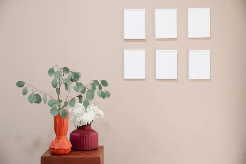
Nicklen's work is available across a range of print sizes, and the framing dimensions added around each print can either amplify or temper the image's presence. As a general principle, collectors working with large-format prints — those measuring thirty inches or more on the longest edge — benefit from proportionally generous frames and mats that allow the image to dominate without appearing crowded. Smaller prints, displayed as part of a curated grouping, often benefit from consistent frame profiles and mat widths, which create visual cohesion across works that might otherwise feel disparate.
"I treat the wall like a composition," says a collector in Chicago who displays five Nicklen prints in a dedicated gallery corridor within her home. "Each frame had to relate to the others. I kept the same frame material and mat color throughout, and varied only the print size. The result feels like a single statement rather than five separate decisions."
Honoring the Vision
Ultimately, framing a Paul Nicklen photograph is an act of stewardship. The collector becomes, in a small but meaningful way, a collaborator in how the work is received — by visitors, by family members who pass it daily, by the collector themselves in quiet moments of private attention.
The wilderness that Nicklen has spent his career documenting is not decorative. It is urgent, alive, and irreplaceable. A thoughtfully framed print does not merely decorate a wall. It creates a sustained point of contact between the viewer and a world that most will never directly encounter. In that sense, the frame is never just a border. It is an invitation — carefully extended, deliberately designed, and worthy of the image it holds.